Pant Dog Center
How improving the usability & visual design of a dog daycare’s website led to a 36% increase in engagement
- Website redesign
- visual design
- ux/ui
Background
More options, more decisions
Pant Dog Center is a small business that offers dog daycare and other services. When they first opened, there were the only dog daycare in the neighborhood. Now, there are several.
For dog owners, this means more time shopping around and making decisions. When they go to a website, dog owners need to easily find information and understand what makes the dog daycare unique.
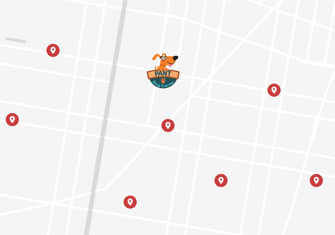
Map of Pant & several dog daycares nearby
project brief
Redesign goals
I redesigned Pant’s website knowing users’ needs and the client’s goals. The client wanted the redesign to:
- Drive more people to their services
- Position Pant as a community resource
- Be feasible to implement without a developer
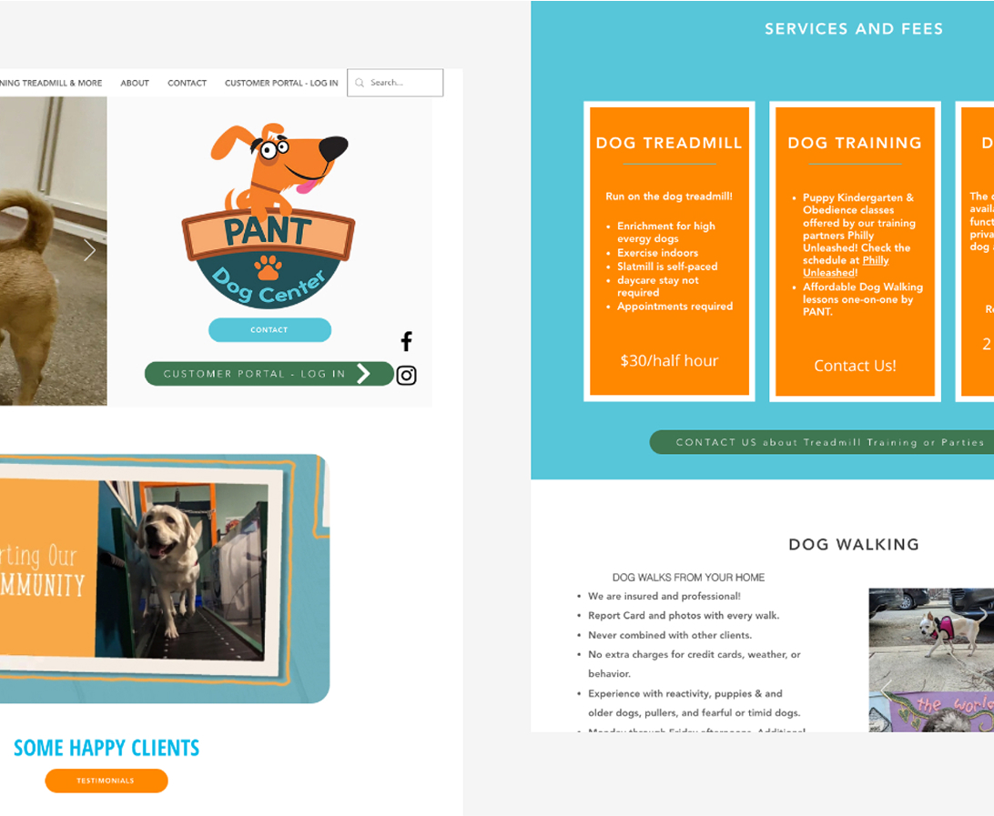
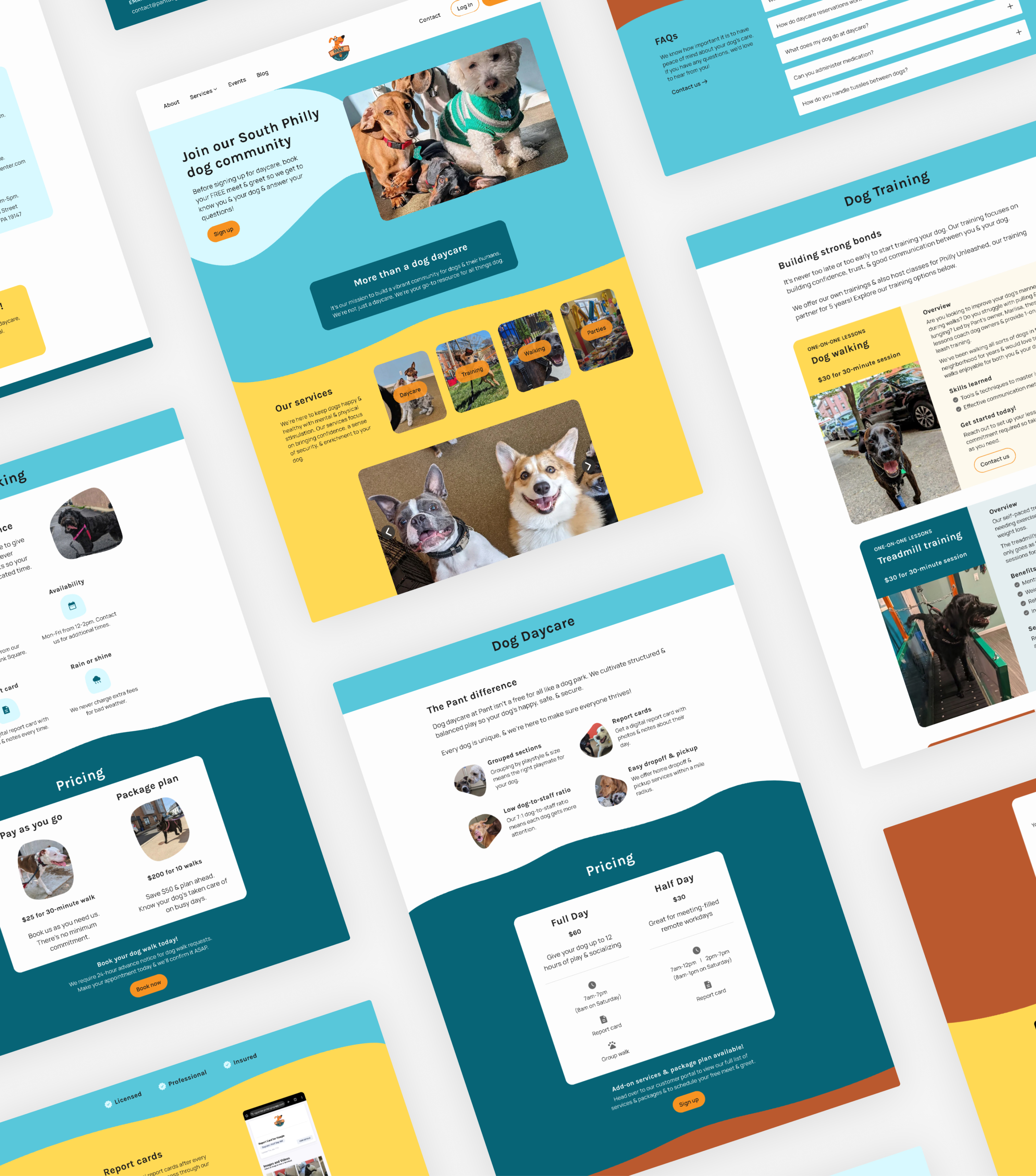
Pant’s website before
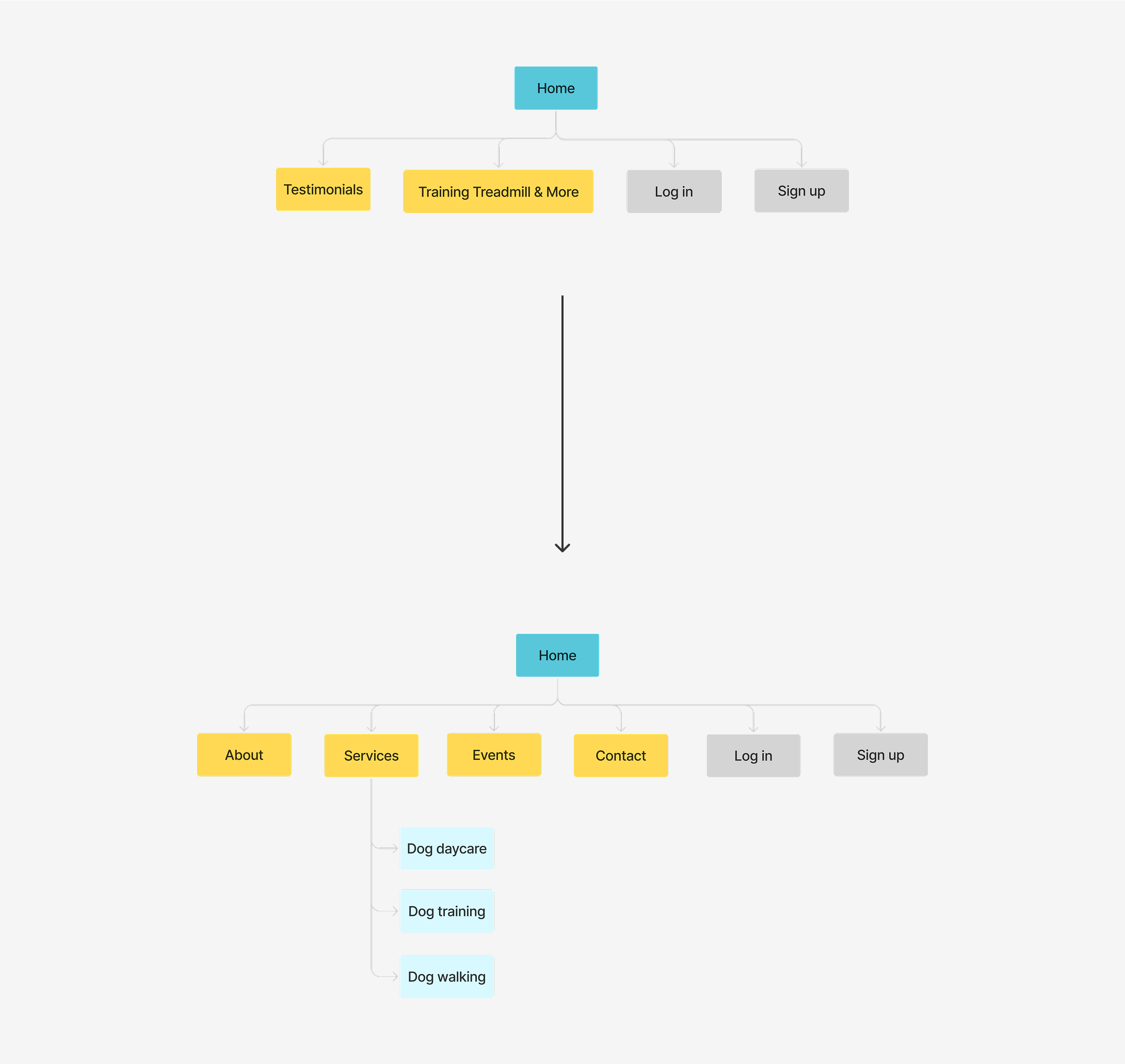
Information architecture
A new structure
After doing a content inventory and audit, I updated Pant’s sitemap to clearly separate and label each category of content and updated their copy.
Previously, information about Pant’s services were spread between the Home page and the Training, Treadmill, & More page, and it was unclear where users needed to go for what.
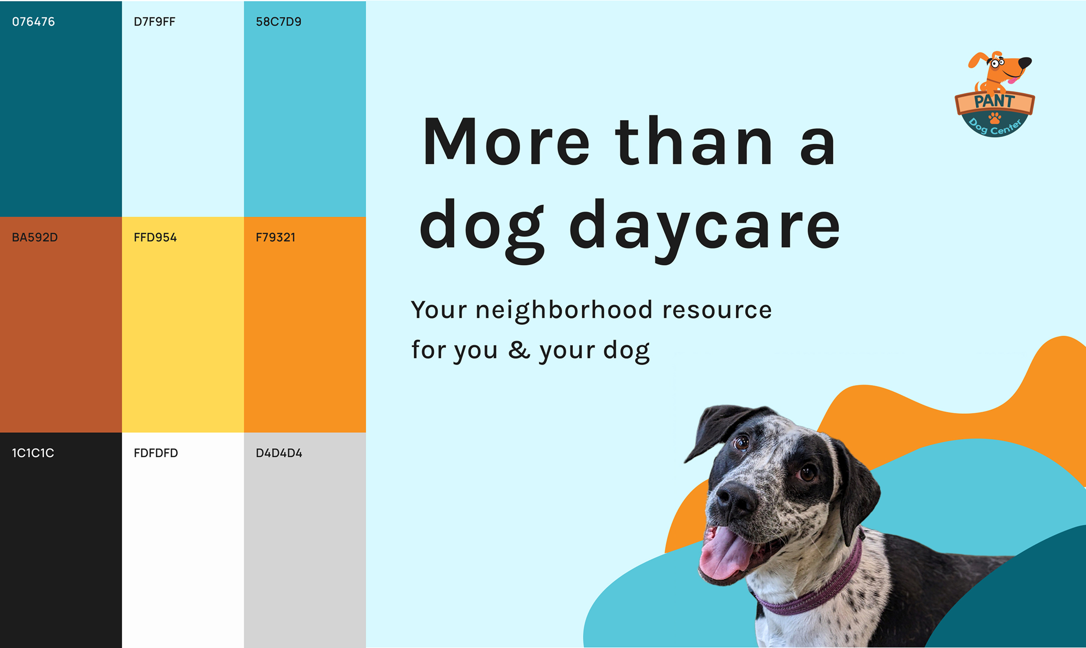
A stronger identity
A new structure
I kept Pant’s existing logo and drew from it to expand the website’s color palette keeping accessibility in mind, as well as Pant’s brand around community.
I also used playful borders and shapes to add to their bright and friendly personality.
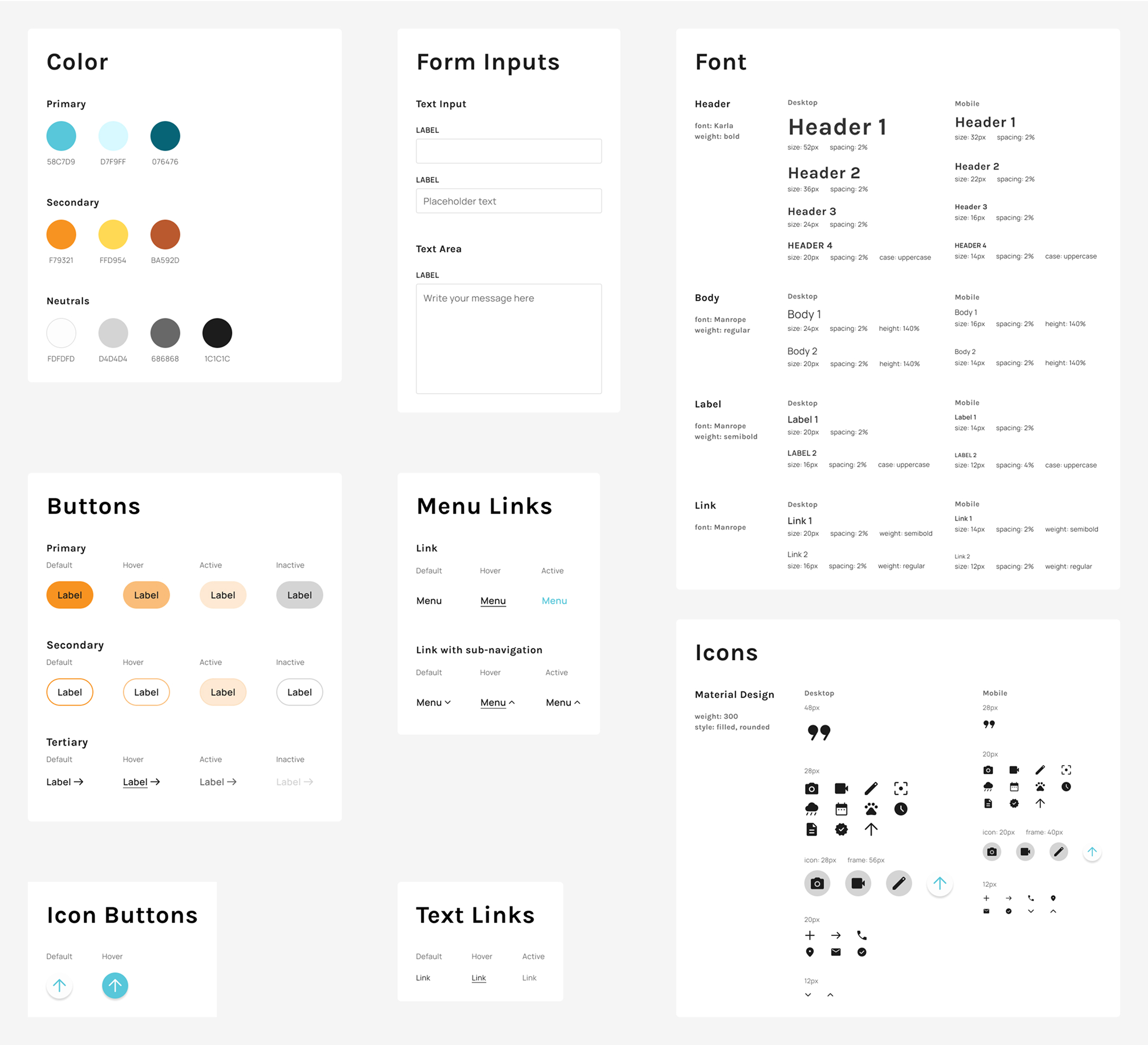
UI
The building blocks
I developed a UI kit with icons, buttons, typography and other components.
Without a developer on staff, it was important to clearly document elements for consistency now and later down the road if the client makes changes.
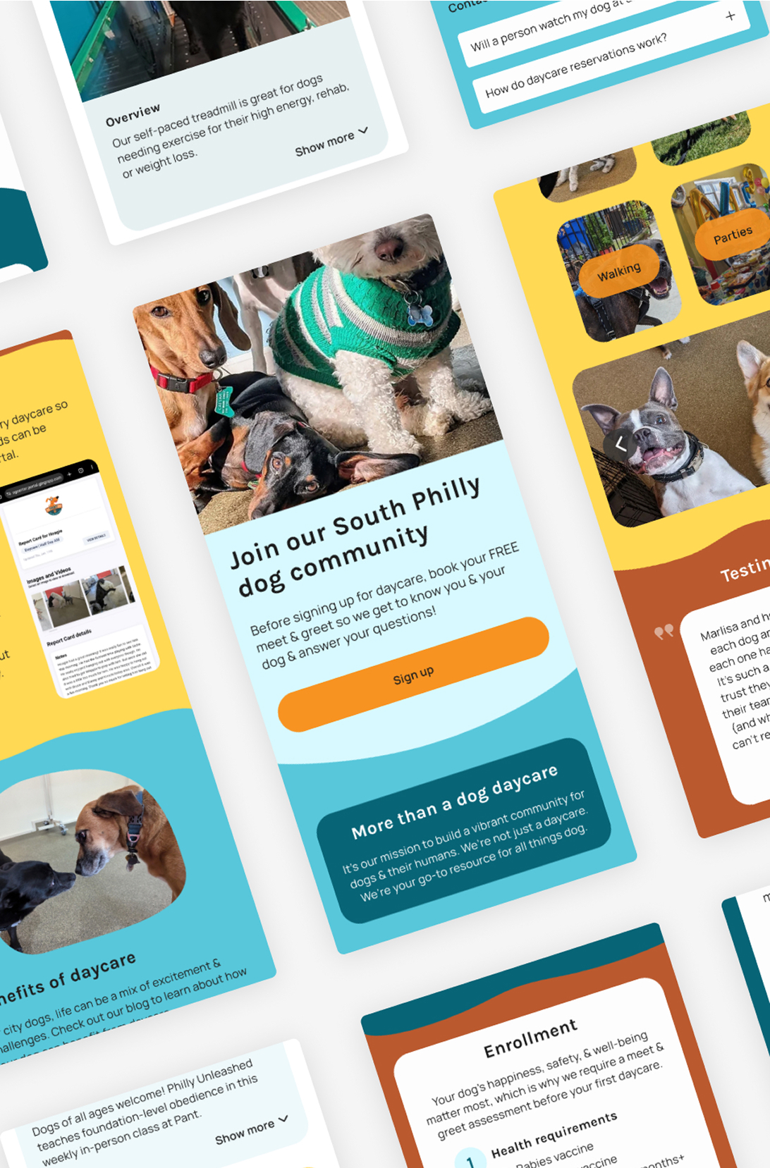
Design
New & improved
I reimagined the website to improve its structure, visual design, and accessibility so users can easily find information about their services and understand who Pant is.
Results
What happened
The client couldn’t fully execute the redesign but because I was consistent, organized, and clear in my documentation and design, they were able to adapt.
Overall, improvements were still made to the website’s navigation and usability leading to these results:
- 36% increase in engagement
- 125% increase in interactions
- 4% increase in organic traffic