Opal
Building designers’ confidence in digital accessibility with a mobile app for social media graphics
- product design
- ux/ui
- branding
Background
Accessibility benefits everyone
Social media is a space for people to organize and share resources with each other, especially during times of crisis.
But when the graphic design in the post has low color contrast, small text, or another accessibility issue, it excludes disabled people from getting information and engaging with that post.
Making social media graphics accessible means everyone, including disabled people, can access it and fully be a part of community-building online.
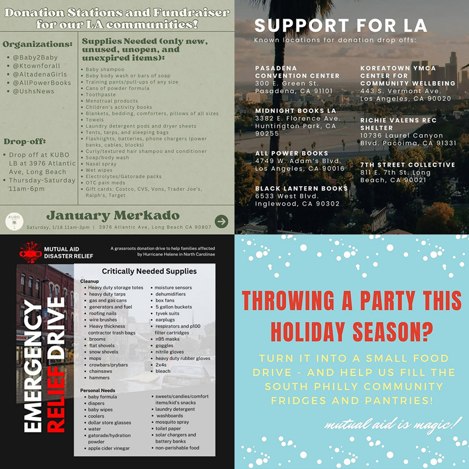
Graphics from Instagram with low color contrast & small text
Problem
Lack of confidence
People know and care about accessibility but have difficulty integrating it into their design process because they don’t feel knowledgeable or confident about practicing it.
Solution
Practice & learn
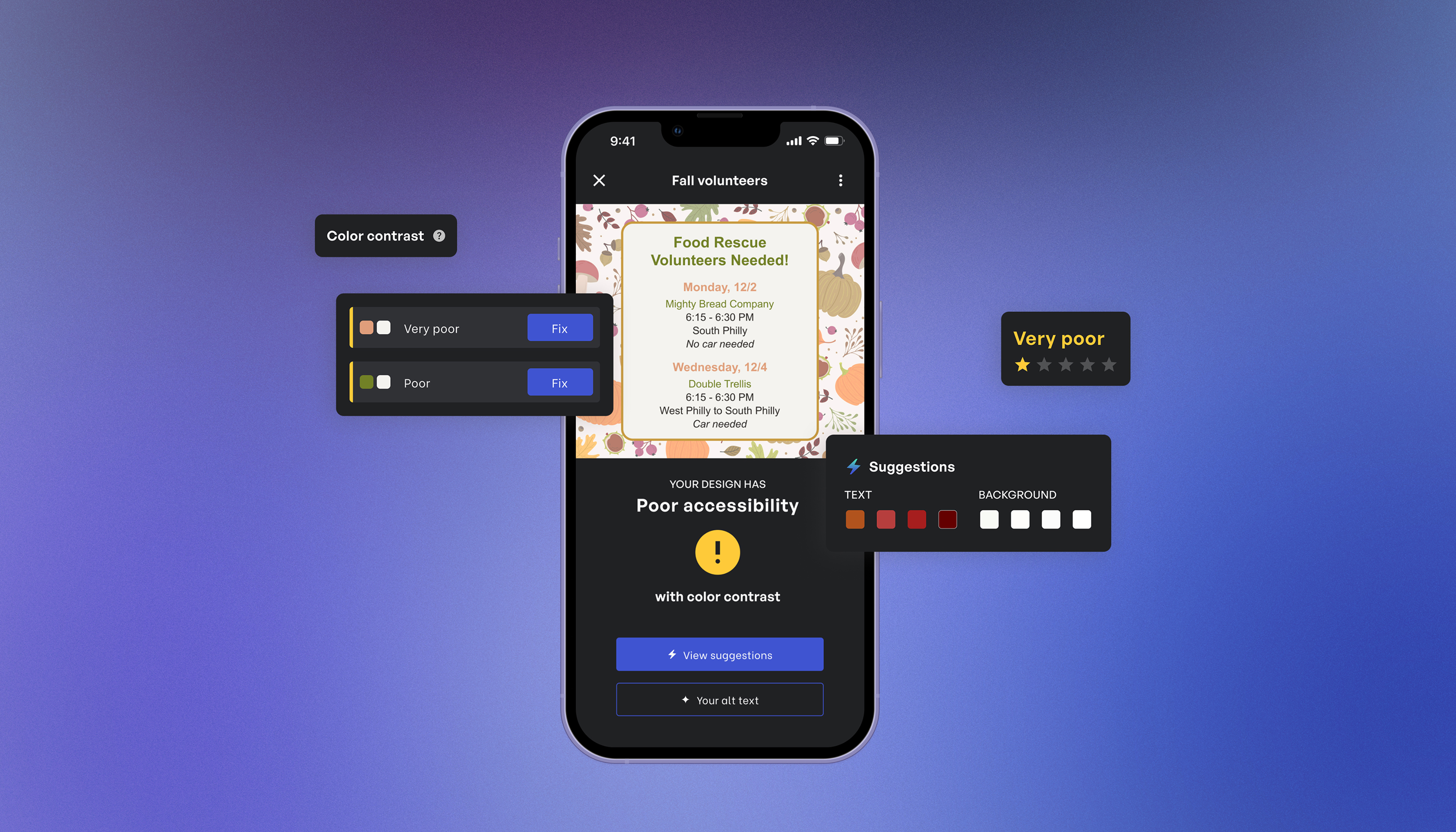
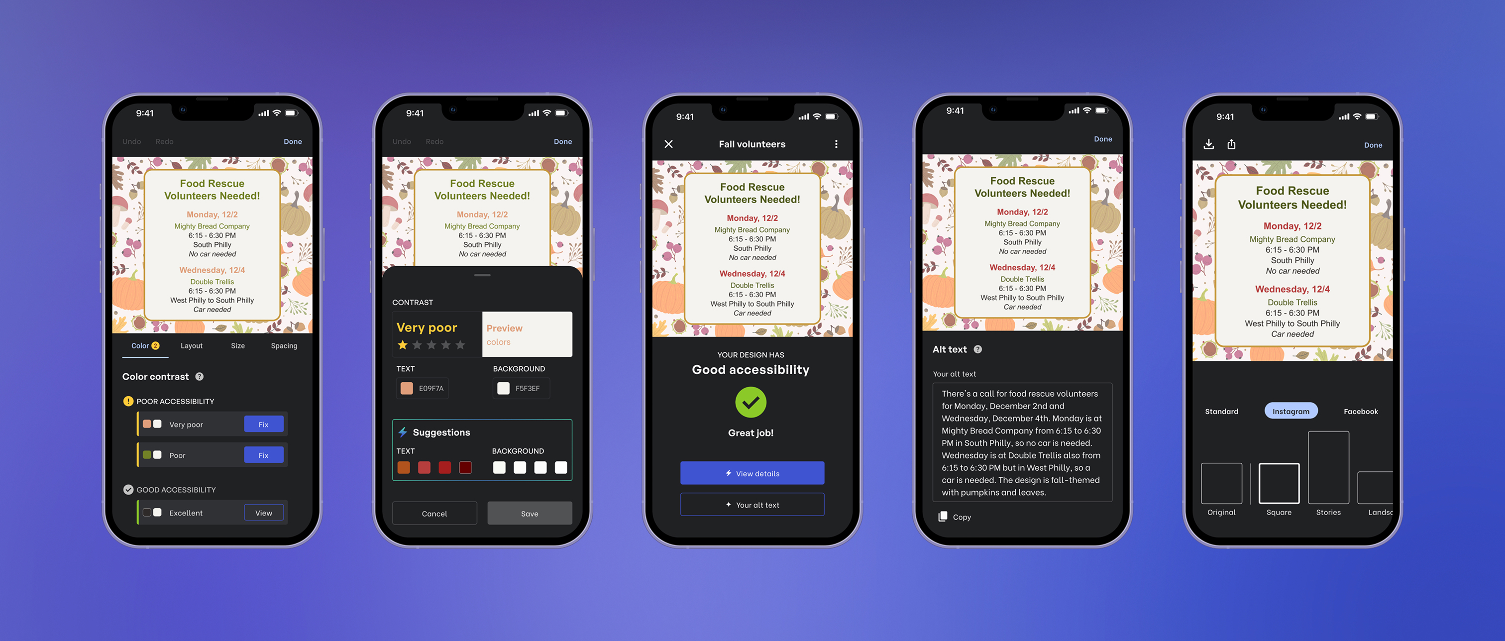
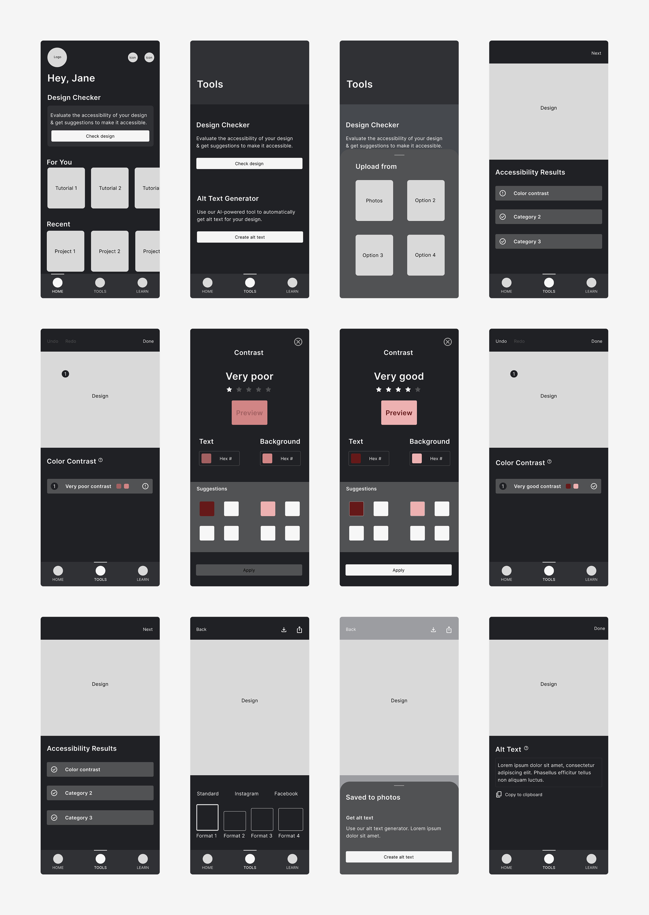
A mobile app that easily makes social media graphics accessible and builds people’s learning and practice with accessibility through 4 features:
- Accessibility checker
- Alt text generator
- Image resizer
- Tutorials
research synthesis
Who are the users?
Two personas came out of my competitor analysis and user interviews: the professional designer and non-professional designer.
Regardless of design experience and familiarity with accessibility, they both aren’t confident in their knowledge about accessibility and how to make it part of their design process.
“I wish I knew more about different options & ways to make designs accessible.”
— Non-professional designer
“I don’t feel well-versed in the many ways you can make things accessible to others.”
— Non-professional designer
How might we help non-professional designers easily make accessibility decisions so they feel knowledgeable creating accessible designs?
How might we help professional designers quickly & thoroughly check accessibility so they’re confident their designs are accessible to everyone?
ideate
Easy accessibility
I designed a mobile app that makes accessibility feel effortless to practice. It streamlines the process from design to posting and offers solutions to build people’s knowledge and confidence in it.
After creating user flows, I built and refined wireframes around what users can do:
- Check and fix designs for accessibility
- Create alt text
- Resize images for social media
- Complete tutorials
Branding
Building the identity
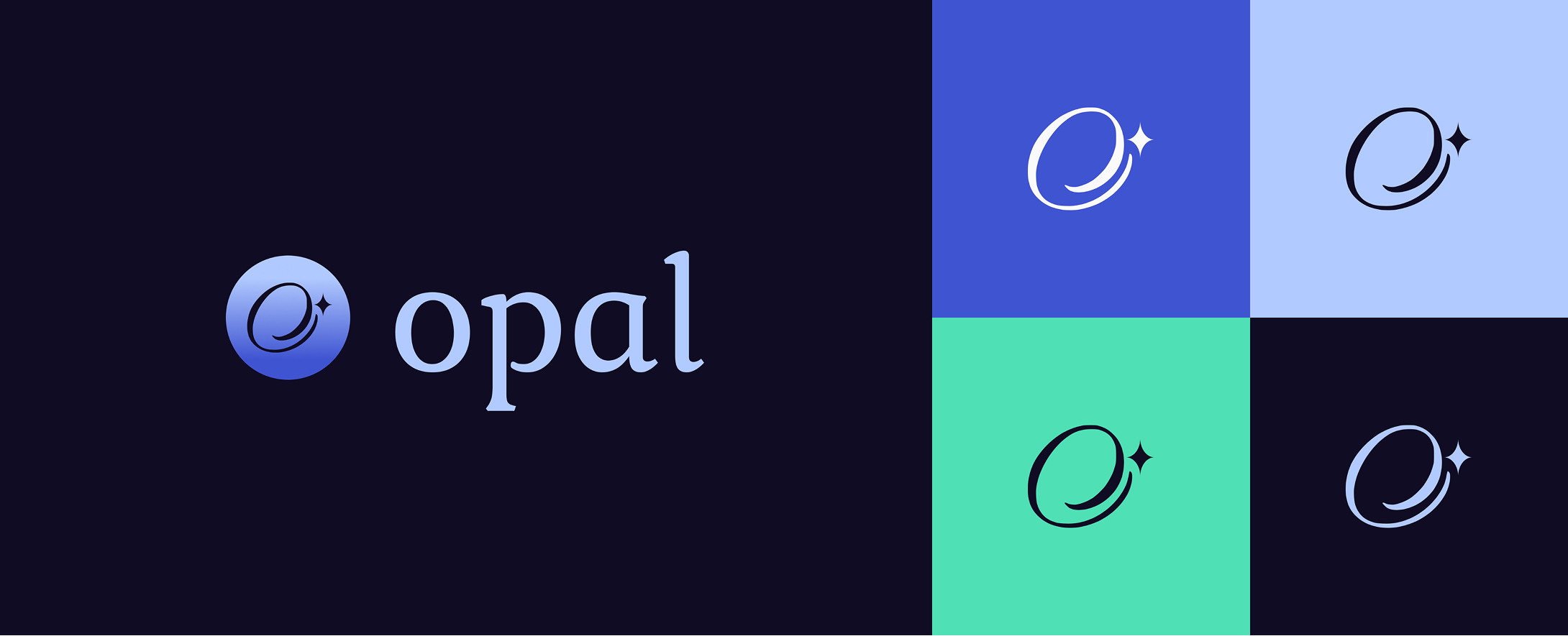
I decided on the name Opal since like the stone, this app catches your attention and draws you in.
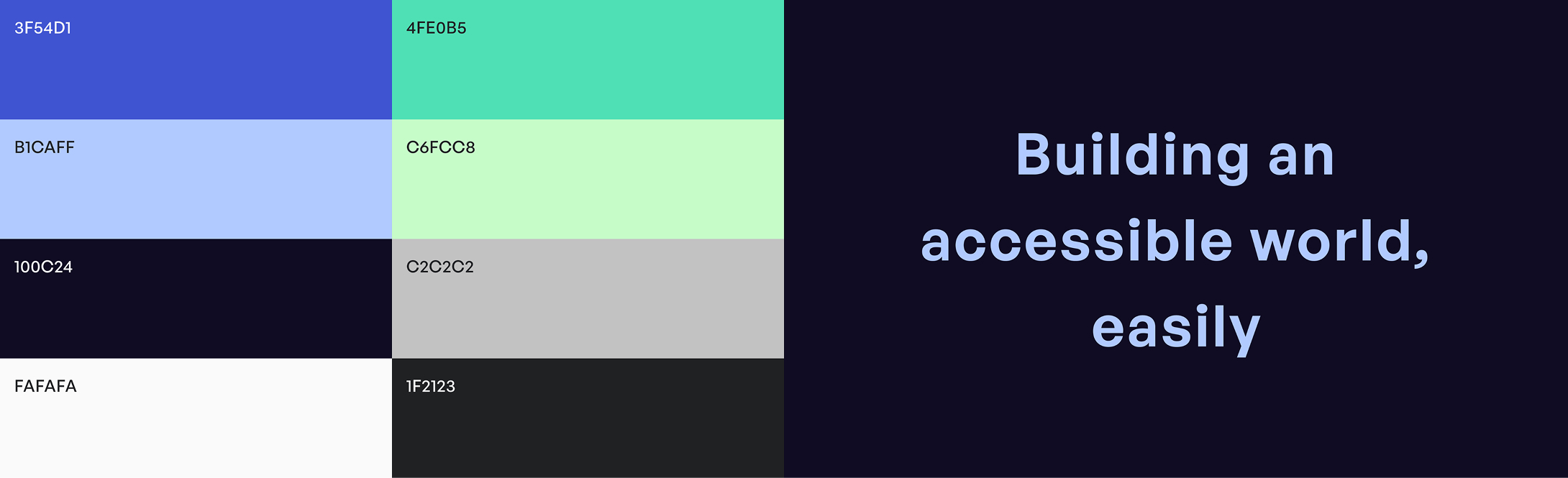
I designed a logo that gives a sense of movement and arrival at a place and took inspiration from the northern lights for my color palette.
“Once you adopt a new [accessibility] practice, it slowly gets easier … before you know it, it will become second nature.”
Results
Accessibility is for everyone
Opal goes beyond making things accessible to disabled people. It makes it possible for everyone to build accessibility into their everyday thought and practice and be part of making design and social media more accessible.